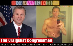
 Gawker.com fans were in full rebellion over the Gawker brand redesign. Some threatened to never visit the site again. The Twittering class hated Gawker’s redesign launched February 7th. On February 9th, that all changed. Gawker.com broke the story of the “classy” Congressman showing off his flabby torso and traffic boomed.
Consumers pretty much always hate change–witness the initial flack when the new Starbucks logo launched last month. For the Gawker brand, the reaction to their new design was as hate-filled as it was predictable. From Twitter:
FruitMuffin The new gawker redesign is terrible! @Gizmodo and @Lifehacker, I’m sad to say it, but you just lost a reader, it’s too annoying to use.
Zombie_Rights Wow, ok. Who decided to let Satan himself redesign all the Gawker sites, anyway? I was wondering what the big deal was about, and yeesh
norahpdx gawker‘s site redesign makes my face hurt. what a disaster.
Wise companies use design for strategic purposes that may or may not initially please the masses. In Gawker’s case, their new design makes it possible to put their important stories first. The old design locked them into a a reverse chronological order, making an important story disappear off the home page as new material was posted after it. Strategically, the move made sense.
Consumers don’t always understand strategy–they are driven by familiarity. The wisdom of Gawker’s redesign hit two days after the new site look launched. The icky pictures of a congressman who imagines himself hot proved irresistible. Traffic was still up by 22% as of yesterday, the latest available Alexa stats as I write this post. And this hot story is on the Gawker front page (though a Tom Cruise/Scientology Slave article–with an equal creepy factor–has nudged it further down towards the bottom.) The new design makes it possible for Gawker to squeeze this story for all it is worth in terms of site traffic and time on site–and that makes strategic sense, whether you like the design or not. Likeability is a direct function of familiarity.
Design is important to brand, but in the end, product is more so. A great logo and great packaging can’t save a crappy product. The Gawker grand is about supplying “gossip from Manhattan and the Beltway to Hollywood and the Valley,” is something they continue to do very well.
As for the Gawker brand redesign haters, they can chill a bit. The new design will grow on them. Most brand redesigns do.
