Okay, the new Gap log did suck. But EVERY new logo design ALWAYS kicks off a spate of negative logo reviews, and many new logos don’t suck. Crowd sourcers beware: consumers hate change.
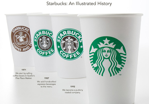
Google “New Starbucks” logo, and you’ll see page after page of negative reviews. Negative response to change has always existed. That social media magnifies the negativity doesn’t mean that initial dislike signals a brand disaster. If every company making a logo change backs off when hit with inevitable Gap-like criticism, no brands will ever visually improve and great design will cease to exist.
 Anyone who has tested new names or logos in a focus group knows the dynamic: when people are faced with something new and different, they recoil. Companies that back off change because of that knee-jerk reaction totally miss the point of doing something different. If you want to attract attention, convey a new message, become memorable, you have to unsettle people. In my naming practice, I know that names people like are names within the comfort zone. They are familiar, known, and understood–and totally the wrong choice for a winning brand. The same is true for logo designs. The best creative choice for a name or a logo is the idea that makes people stop and say, “whoa!”
When choosing a new logo, you want to get the associations right. Don’t ask non-designers to evaluate the art. You’ll get as many people saying “it’s too simple” as you will get saying “it’s too busy”. Dive past the inevitable superficial negatives and get to the specific feelings: “What does this logo make you think about?”
 For a logo to become “liked” or even “loved” takes time. As Michael Bierut writes in the Fast Company review of the immediately much hated new Big Ten logo: “But let’s remember that the previous Big Ten logo, which fans now absolutely love, also met with resistance when it was first introduced twenty years ago.”
For the record, regarding the Starbucks redesign: The new logo is great. But the ability of a new logo to move that company beyond coffee is negligible. Starbucks has spent over a decade trying to be coffee + something more and has failed. The new logo won’t fix that problem.
