 Outgrowing the Brand
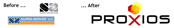
Proxios had its beginnings as a small technology infrastructure outsourcing company called SuperServer. The company has grown beyond its Richmond, VA roots to have a national reach and had made significant investments in cutting-edge technology. They needed a brand that would convey the true stature of the company and give it a better footing for growth.
Finding Opportunity Among Sound the Same/Look the Same Competitors
Our work began with extensive market research, including a comparative analysis of copy and design used by competing companies, and interviews with current, past, and potential customers. We found that companies were using essentially the same words to say the same thing:
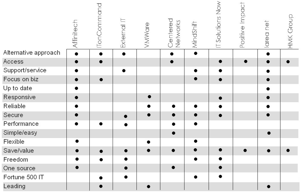
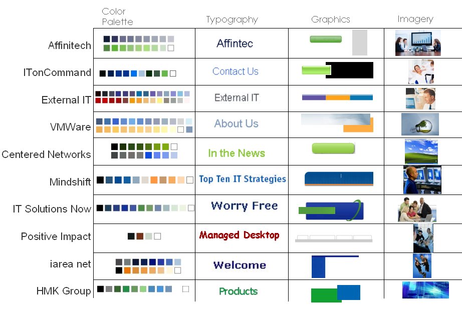
We found that competitive approaches to design were similarly undifferentiated:
We positioned company around the concept of “responsive service.”
Renaming: Finding a New Brand Name for the Company
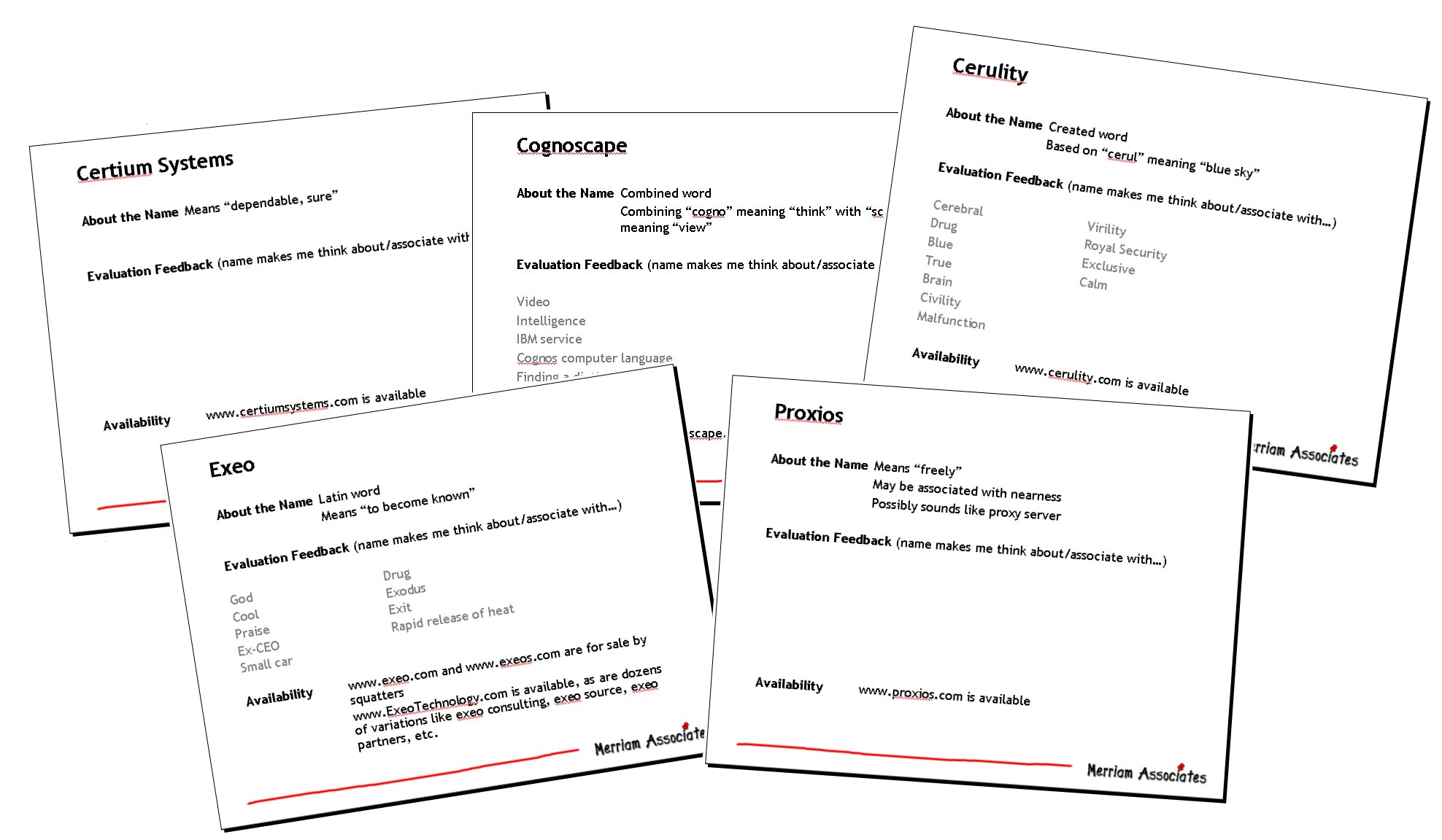
The SuperServer name could not effectively carry the company forward. Both employees and customers felt the name was too small time and old fashioned. We conducted a thorough naming program, considering hundreds of concepts, testing dozens of candidates through our proprietary process and eventually selecting Proxios.
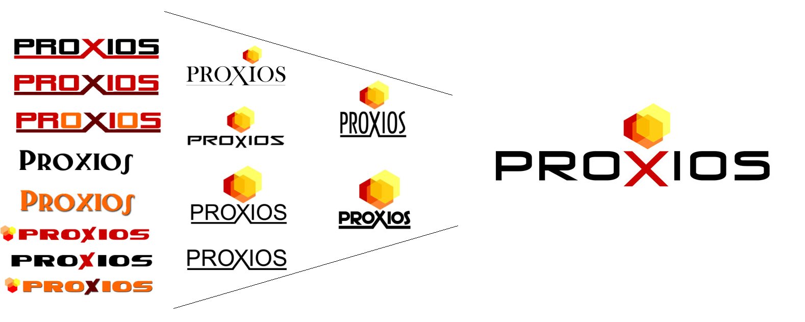
New Proxios Logo
We created a new logo that raises the company above the visual cliches so common to the category.
A Visual System Unifies and Strengthens the Brand
To support the logo and tell the Proxios brand story, we designed a visual system that unified the look of all the company’s marketing communications pieces. We used hexagons in the logo and visual system because they are a visual metaphor of what Proxios offers:
* Are a highly space efficient shape
* Are one of natures strongest, stiffest, most stable structures
* Have a high ratio of strength to weight
* Tessellate—that is, they create a solid plane with no overlaps of gaps into infinity
* Are graphically simple and flexible
We selected at a color palette that is differentiated from the blue/green/orange cliches of technology—warm colors suited to the risk mitigation/headache removal story in strong hues that talk to the reliability/responsiveness positioning. We provided a usage guide to help our client manage the creation of materials internally and with other agencies.

Strong, Unified Brand Communications
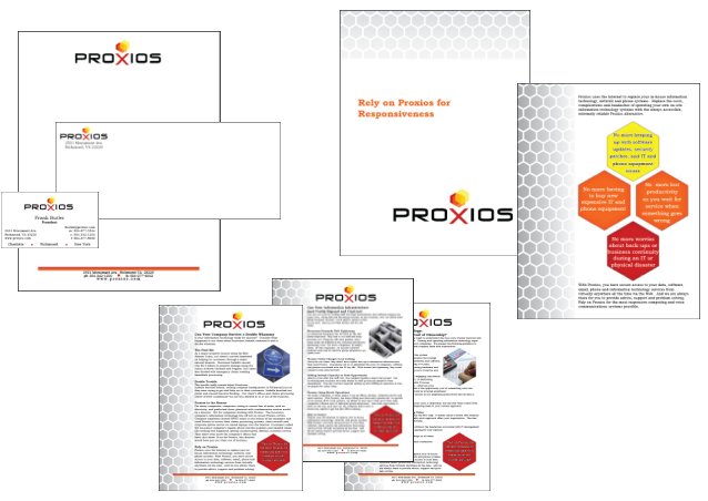
We wrote and designed the entire suite of communications materials, down to the business cards, and continue to support Proxios through the brand relaunch and as they ramp up marketing.