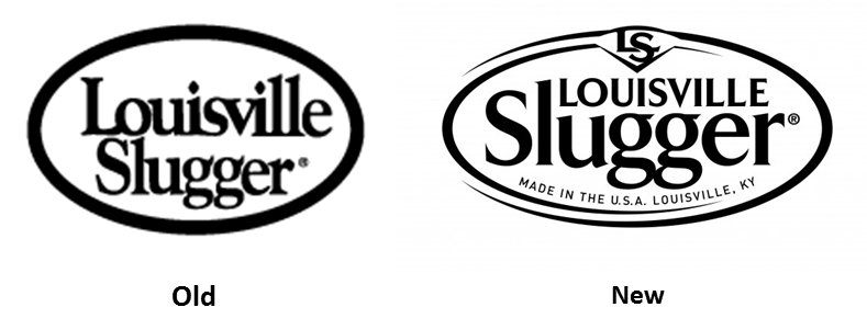
Louisville Slugger unveiled its new logo this week and it is a home run. So often, when companies have adopted a new logo, they have stripped their visual identity of all personality in favor of “updating,” “streamlining,” or “going more upscale.” Louisville Slugger wisely went in another direction. For a brand well into its second century of life and with such an iconic following, they wisely adopted a look that is full of personality. The new look is at once timeless and contemporary, but would not be out of place at the turn of the century–the last century.
Contrast this success with ebay’s charmless new look. When your new logo works, you also mitigate the I-hate-the-new-look impulse reaction that many rebranding efforts provoke.

